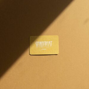
Black Letterpress Business Cards
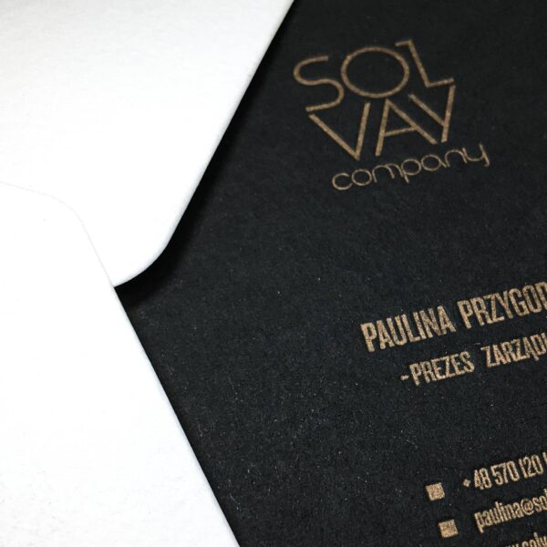
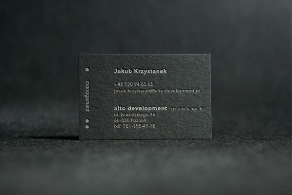
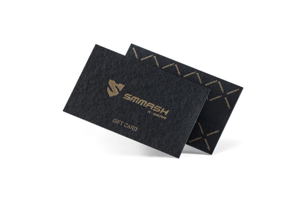
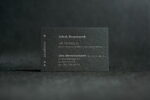
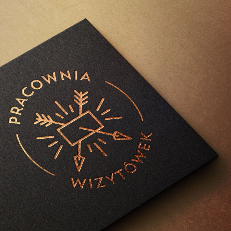
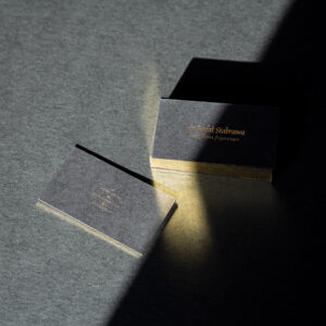
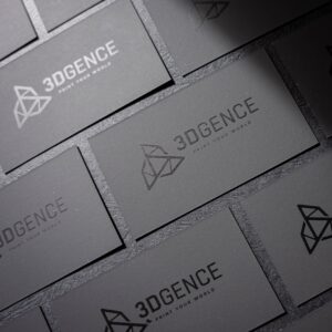
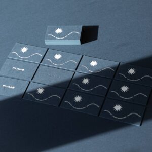
Are you searching for a business card that will make a lasting impression? Our black letterpress cards can do just that. We use a precise embossing technique on thick black paper to achieve a stunning effect. Adding metallic Pantone inks to the mix creates a striking contrast between the black paper and the metallic elements, resulting in a gentle shimmer in bright light.
It’s important to note that letterpress printing is one of the world’s oldest and most respected forms of printing. This intricate embossing and printing process produces a highly durable and precise effect. Black letterpress business cards are a timeless and luxurious way to present yourself or your company with elegance and sophistication.
| Quantity | Price | You save |
| 100 pcs | € 105 | – |
| 150 pcs | € 150 | 5% |
| 200 pcs | € 195 | 7% |
| 250 pcs | € 235 | 11% |
| 500 pcs | € 440 | 17% |
Features
Guidelines
File format:
.ai / .pdf (maximum size 32 MB)
Dimensions:
85×50 / 85x55 / 90×50 / 90x55 mm
Bleed:
3mm on each side
Color scheme:
Pantone – a maximum of 3 colors on the front (embossing without ink counts as 1 color). The second side is blank. We use only metallic colors on black paper – gold, silver, copper, and occasionally black or embossing without ink. Printing white on a black surface is impossible in the letterpress technique.
Texts:
All texts must be converted to curves
Graphic resolution:
Only vector graphics are allowed
Safety margin:
3mm from the edge
Die-cut tolerance:
~0.3-0.6 mm
Important:
If you have any doubts or questions, please contact us before purchasing: contact@businesscardstudio.com After accepting the order, there is no possibility to change the data, quantity, or specifications of the business cards, change the delivery country, or cancel the order. Please make thoughtful decisions.
Design Tips
Text size:
When preparing your design, assess whether the font size will be too small visually. As a rule of thumb, we recommend a minimum font size of around 6-7pt, but each font style should be approached individually. In the case of denser metallic inks, we recommend using larger elements.
Text color:
The sharpest and clearest text typically comes out in black.
Safety margin:
Due to inevitable shifts during the production process, try not to place important content within a distance of less than 3mm from the cutting edge.
Bleed:
Bleed refers to elements that extend beyond the cutting lines and the final dimension of the business card. Any graphics meant to be printed to the edge should extend beyond the cutting area by 3mm on each side.
Graphic elements:
Letterpress printing requires vector files exclusively. Avoid making them too large, as otherwise, artifacts may be visible on the other side of the business card. As a general recommendation, large elements should not exceed 20-30% of the card's surface and should not overlap the edges (preferably not at all) – paper in these areas may warp during die-cutting.
Frames:
Due to cutting tolerances, avoid placing frames too close to the edges. 5mm is an absolute minimum.
Print specificity:
Depending on the substrate, colors may appear differently in print than in the color guide (not to mention your monitor). Keep in mind that letterpress printing is a craftsmanship technique. This means that all business cards will differ from each other, for example, in color saturation, and characteristic artifacts may occur during the printing process (such as ink wear). We love These subtle nuances in this technique, but if you have yet to experience letterpress printing, some of them may surprise you slightly. Therefore, if you have any doubts, don't hesitate to contact us, and we will be happy to answer any questions.
